Colors assume symbolic meanings assigned by different cultures and show a psychological character that directly affects human moods. In this article, we want to deepen the application of color to different fields of human activity, more especially in the digital marketing sector and how to apply the range of colors for campaigns with a visual format.
Do you want to know more about the range of colors? Stay reading this article!
Also Read: WHAT IS A COMMUNITY MANAGER?
THE IMPORTANCE OF COLOR GAMUT IN COMMUNICATION
Table of Contents
Color is one of the most complex elements within the visual syntax, but it is the element that most influences human vision and behavior, in fact, a new science called chromotherapy has emerged today, which studies the effects of color in the human nervous system and its healing or therapeutic power.
Color is one of the most complex elements within the visual syntax, but it is the element that most influences human vision and behavior, in fact, a new science called chromotherapy has emerged today, which studies the effects of color in the human nervous system and its healing or therapeutic power.
Its basic functions in the field of graphic design, industrial design, interior design, advertising and art are presented. We can distinguish four ways to approach color :
- As a pigment: it takes us to the field of painting and the plastic arts in general, where colors are obtained through subtractive synthesis, this means that the sum of all colors gives us the color black.
- As light: color is perceived through additive synthesis, where the mixture of all colors gives us white light, this leads us to Newton’s famous discovery about the decomposition of white light into the colors of the rainbow as it passes through a glass prism.
- As a sensation: color is the result of the reaction of light in the elements that surround us along with the dominance of some light waves over others, this allows us to identify some colors or others through vision.
- As information. Color can also be approached as visual information that affects our senses, this new approach involves addressing it from a psychological and aesthetic point of view.
The range of colors appears around us, but we cannot know how each individual interprets it, hence, over time, techniques have emerged to analyze how colors affect each individual. Art, along with all the media that treat the image, knows that through color they can experiment with the sensations that they transmit to the spectators and alter their moods. From here we can deduce that many designers also use the range of colors for the creation and development of advertising posters .
COLOR CLASSIFICATION IN COMMUNICATION
In color theory, color gamut is a process used to create a color . The idea of color mixing exists from ancient Greece, although the typology in which colors can be grouped according to their importance, was developed by Isaac Newton in 1704, where he divides colors into primary, secondary and tertiary colors.
PRIMARY COLORS
Primary colors are those that cannot be created by mixing other colors, so they are considered absolute or unique , but can be mixed with each other to produce most colors. The colors that meet these characteristics are yellow, red and blue.
Regarding the color combination that can be obtained from the mixture of the primary pigments, the following classification can be made:
- Primary light colors or RGB model: red, blue and green colors.
- Primary colors pigment or CMY model: cyan, magenta and yellow colors.
- Traditional primary colors or RYB model: red, yellow and blue colors.
SECONDARY COLOURS
The secondary colors are those that are obtained from the mixture of the primary colors with the same proportion , from which the violet, green and orange are obtained, although different models have been studied to determine what these colors are:
-
Subtractive color model
The secondary colors according to the subtractive model originate from the mix between cyan, magenta and yellow.
-
- Magenta + yellow = red
- Yellow + Cyan = Green
- Cyan + Magenta = Blue
- Cyan + Magenta + Yellow = Black
-
Additive color model
Depending on the additive color model, secondary colors originate from the mix of red, green, and blue.
-
- Red + green = yellow
- Red + Blue = Magenta
- Green + blue = cyan
-
RYB color model
For the RYB color model, secondary colors originate from the mix of blue, yellow, and red.
-
- Red + yellow = orange
- Yellow + Blue = green
- Blue + red = purple
TERTIARY COLORS
The tertiary color arises from the combination in the same proportion of a primary and a secondary color. The wide range of colors that we know corresponds to various color mixtures, which can result in both secondary and tertiary colors.
COLOR HARMONIES
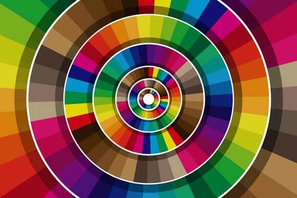
The research and experiences of great painters throughout the centuries, allow us to arrange a set of colors that especially harmonize each other. The best way to explore these color groups is to use the color wheel.
In color theory, harmonizing means coordinating the different values that color acquires in a composition . Harmonicas are considered combinations in which modulations of the same shade, or different shades, are used, but they maintain a certain relationship with the chosen colors.
Color harmonies. The best way to explore color groups is to use the color wheel or circle. A color wheel basically sequentially orders the progression of colors that make up the light spectrum, from red to purple.
Monochromatic harmony. Very simple to use, sober and elegant. It is based on a single color and its different shades. That is, in a color circle, we would be at a single point and we would choose variants of the same value and saturation, with greater or lesser luminosity. You have the risk that it can become monotonous or boring.
Analog harmony. Analogous colors occupy positions immediately next to each other on the color wheel. Due to their similarity, they harmonize well with each other. Such combinations are common in nature.
A good tool that allows you to automatically generate different color harmonies is Colorschemedesigner.com , with which you can choose the colors that best harmonize for your marketing campaigns or to create your corporate logo .
WHAT IS THE MEANING OF THE COLORS?
Let us now see what each of the colors transmits to us and the psychological effects of the colors in the media.
MEANING OF THE COLOR YELLOW
It is the brightest color and gives the viewer a feeling of approximation when placed in contrast with colder or neutral tones. Being a more primary color, it usually has a great presence in design and advertising for children. It is a color widely used in access areas, social rooms and work studios. It is a color that tends to concentration and mental activity. Colors based on the range of yellows are mostly neutral and easy to match.
MEANING OF THE COLOR ORANGE
It has the qualities of red and yellow and emits cozy, warm and stimulating sensations. This color is highly represented in the color palette of great artists such as Rembrandt and in general in many baroque painters who illuminated their models with candlelight, which made the skin of their models turn orange. It is the ideal color to use in family and friendly gathering places . They are often used as part of merchandising in fast food places, since it whets the appetite and creates effects of relaxation and enjoyment.
MEANING OF THE COLOR RED
It means strength and vitality in all areas , his visual power is so energetic that the plastic artist and designer knows that his mere presence on a surface is a fundamental focus of attention.
In the decoration it is a color widely used for the manufacture of objects since they are bright tones that vibrate in light spaces . The use of red in packaging and products is very characteristic, since it emits the illusory effect of advancing towards the buyer, and since it is an energetic color it causes positive affirmations in consumer objects.
It is the most widely used color of the light spectrum in the media and it is also the color that appears the most in the flags of the countries of the world. It is also used to indicate a danger, but this association is ancient, since the primitive peoples when identifying fresh blood in their path, supposed to be on alert, since some danger lurked.
MEANING OF THE COLOR BLUE
It is a color that means distance and discretion, although it also transmits calm and calm. It creates depth and tends to shrink in the presence of warm colors. In Leonardo da Vinci’s Treatise on Painting, he must occupy remote positions as opposed to the warm colors that must be placed in the foreground of a painting. In workshops where you work with fire or in which it is very hot, or in those where there is a lot of movement and racking, they are usually painted in a cold color like blue, since their tonality gives off feelings of relaxation and relief . The blue next to the white suggests cleaning and hygiene, which is why they are usually used in detergent and cleaning product containers.It is also considered a safe color, which is why many banks and insurance and transport companies often use it in their logos.
MEANING OF THE COLOR GREEN
This tone transmits sensations of nature itself such as freshness and vegetation. If he tends towards yellow he is vibrant and energetic, but if he tends towards blue he becomes more sober.
In hospitals and specifically in operating rooms and surgical clothing, light green is used because the surgeon’s eye, when exhausted by the predominant presence of red during an operation, needs to rest its gaze on the color green, a complementary color of red .
In decoration it is usually used for spaces related to hygiene.
MEANING OF THE COLOR BROWN
It evokes maturity, earthly and comforting. In the baroque and especially in the tenebrism it gained great value as a color shade, especially in artists such as Ribera and Caravaggio who used it insistently in their works.
MEANING OF THE COLOR PINK
It is a refreshing , soft and delicate color . The great pastelists of impressionism like Degas used it a lot in their compositions. In interior design it plays an important role in textile fabrics and in advertising aimed especially at children. These named colors have a well-studied psychological function and serve to create different sensory environments in workspaces, factories, schools, offices .
The colors that most predominate in living or work spaces are pastel colors, which increase the feeling of light. Stronger colors such as reds or blues are often used in transit spaces or spaces intended to be short-lived, such as in restaurants or museums.